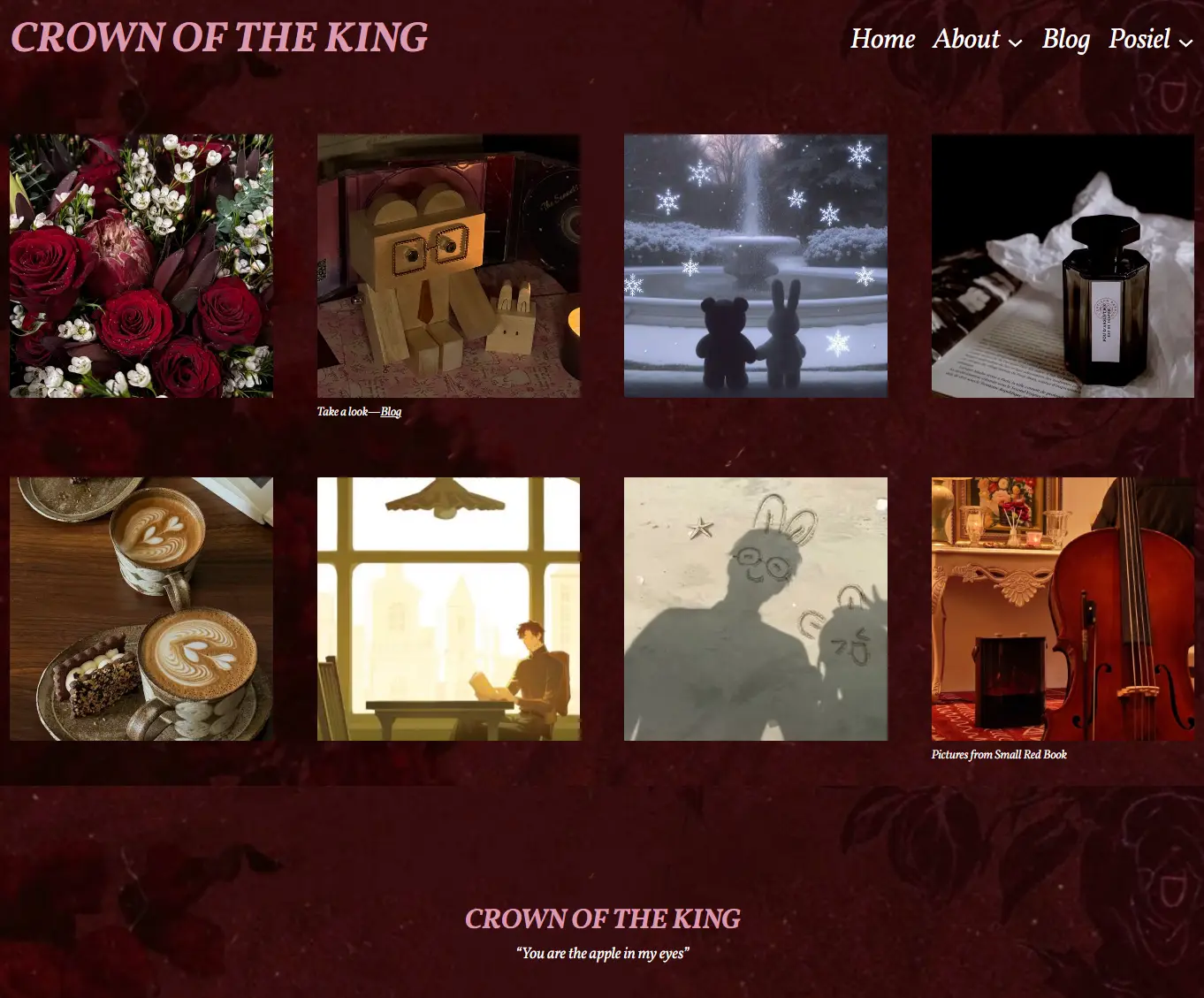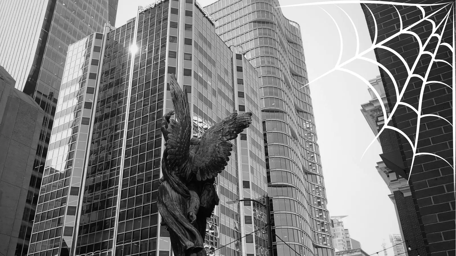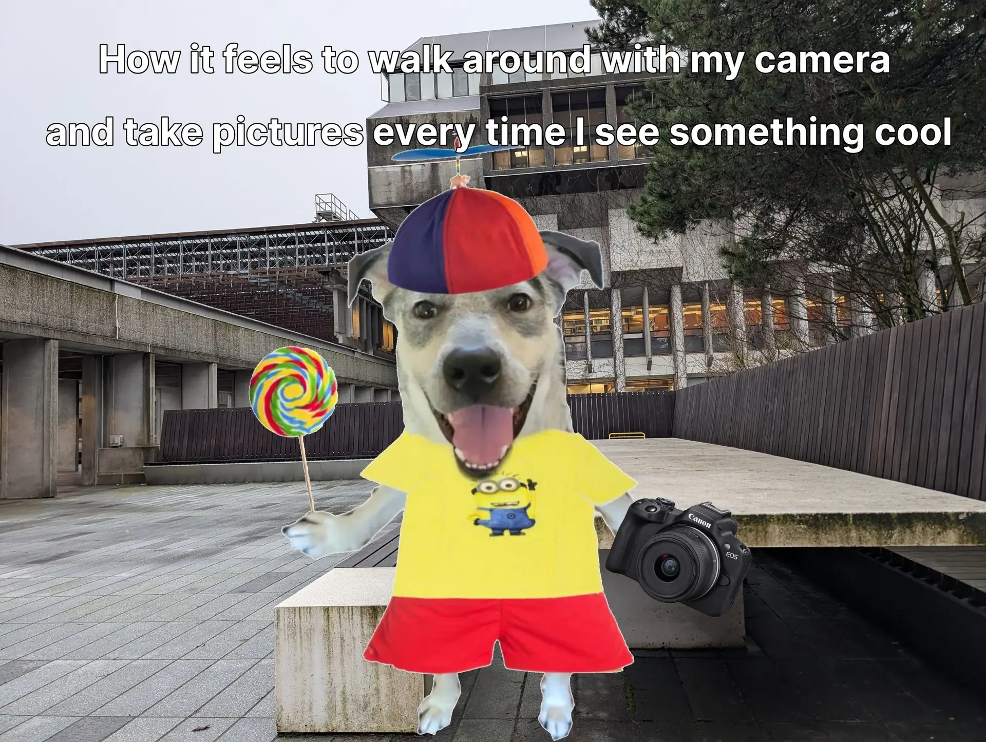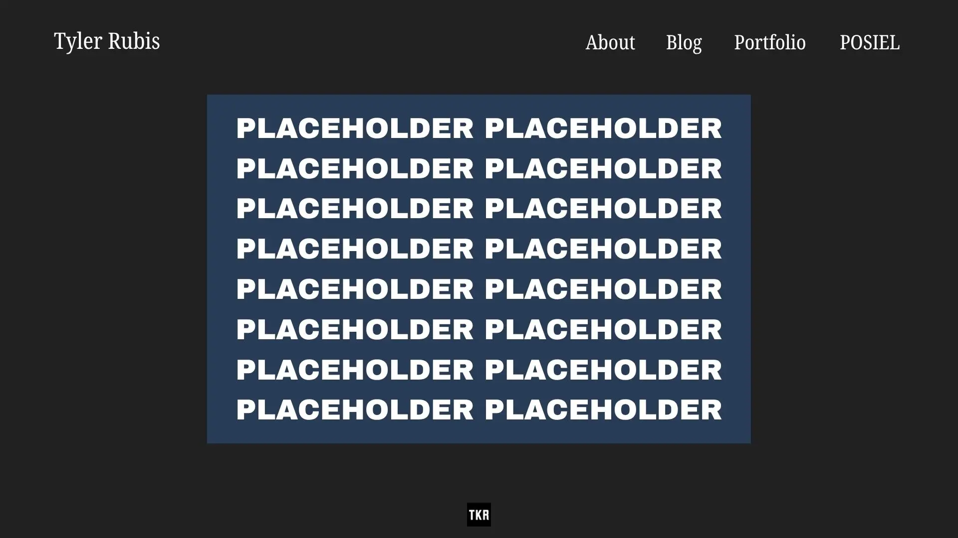
I’ve spent the last several days planning how I want my site to look, and what improvements I’m planning to make. I’m really aiming for something minimal so that my photography can shine through as the central focus, and keeping a simple, professional tone so the site can serve as a portfolio.
I’ve gone through created mock-ups of how I intend to change certain pages on my site, to compare them to how the pages currently look. I posted these mock-up comparisons to my Instagram account @tylerrubisfilms to promote my website as well.
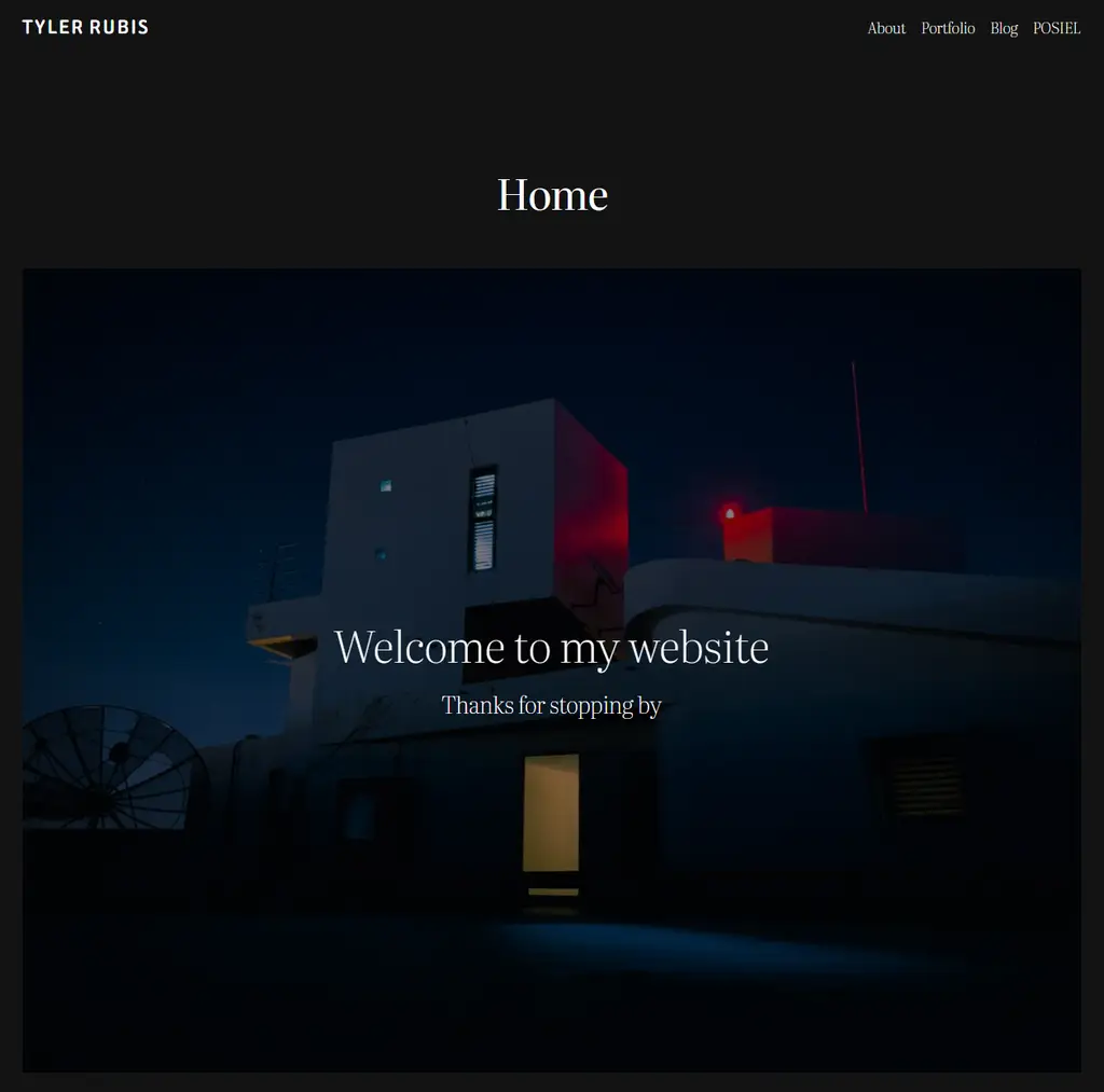
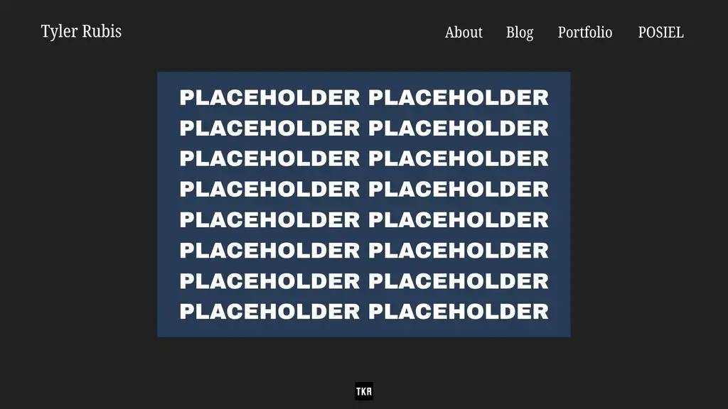
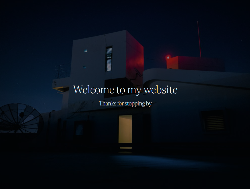
Starting with the home page and general navigation, I’m planning to keep the overall appearance the same, with a single image and a short welcome message being the only piece of media on the page.
As far as changes go, I want to replace the one still image with a gallery that will rotate through multiple photos one at a time. I also plan to make the navigation menu larger so that it is more visible and easier to access. I also want to minimize the gap between the picture/page title and the navigation bar, as I find the gap distracting.
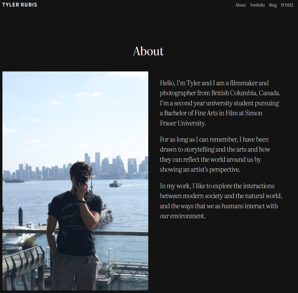
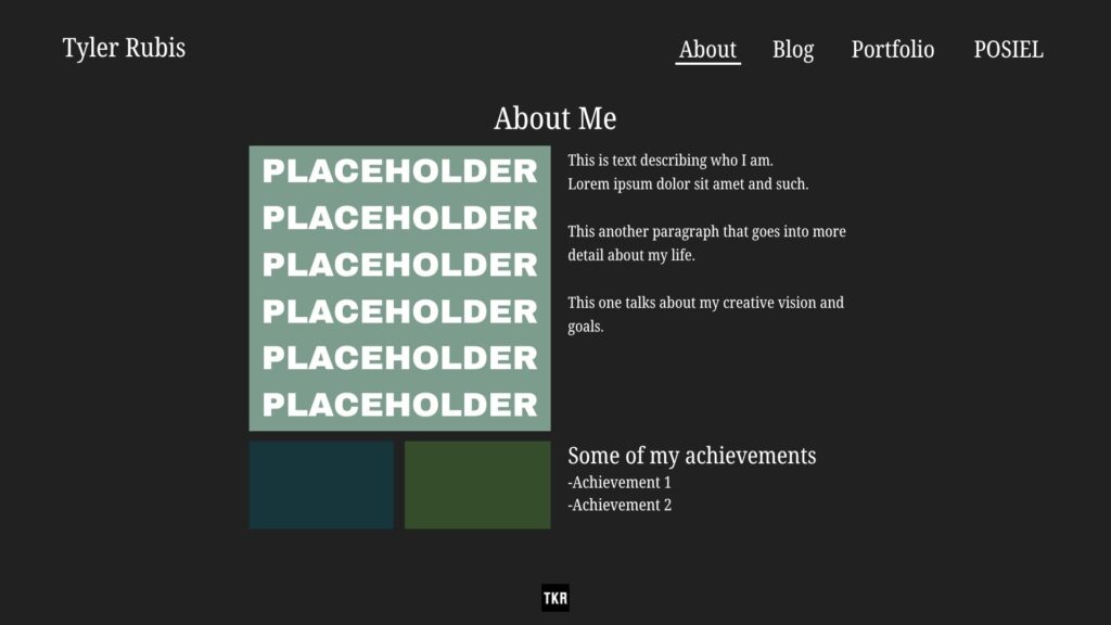
For my About page, I mostly plan to add a bit more information about myself and my artistic vision and goals, as well as add a second section that highlights some of my achievements.
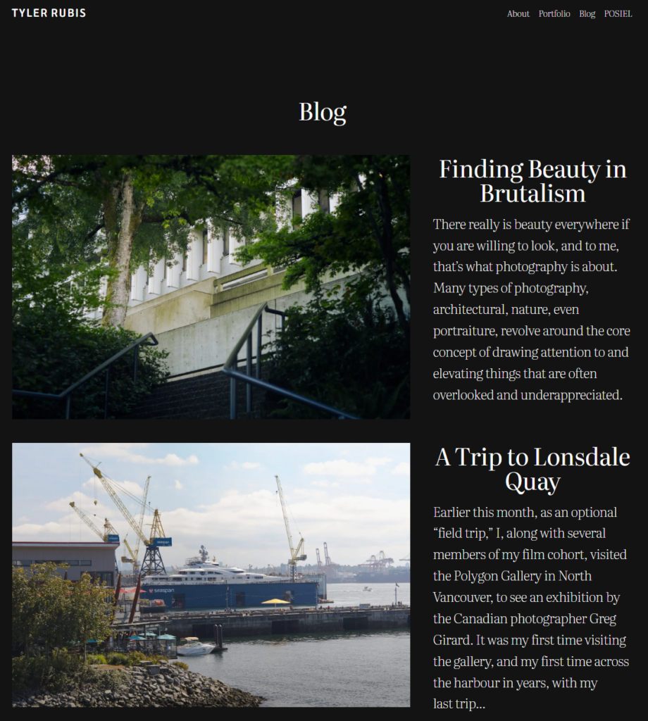
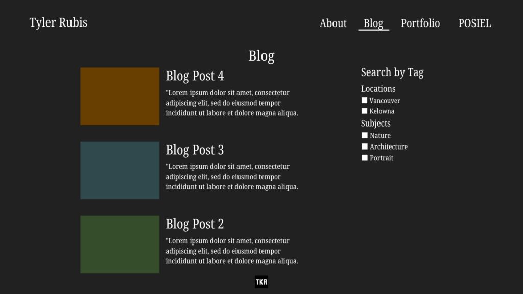
For my Blog page, my main goal is to add search filters, so as I continue to write and develop my posts, users will be able to find specific topics without navigating through my entire blog history.
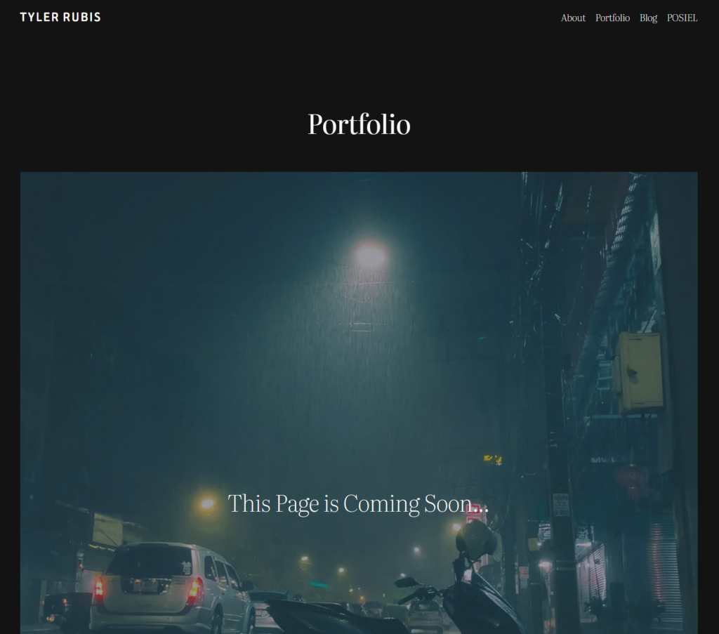
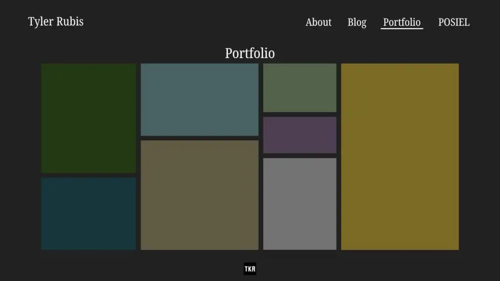
This is where the most work needs to be done. I haven’t yet imported my existing photos and films into the site, but my goal is to work backwards, starting with the pictures that I’ve taken during this course that are complementary to my blog posts, and gradually adding my prior work,
My objective is to create one big page full of photos, where the user can click on each one to enlarge it and reveal additional information, links to a related blog post, or other photos that are part of the series.