Author: Tyler Rubis

  • Peer Review #2

    3–4 minutes

    This week I’m reviewing Asal Ghaffari’s site Music Diary Through Politics. Opening the site, you are immediately greeted by the words “Discover Your Next Great album to listen to” in an easy to read capitalized sans-serif font. Underneath the heading there is a description of Asal’s intentions for the blog, explaining what motivates her album choices and her goals in reviewing them. This heading and description makes the blog’s topic very clear from the beginning. Underneath the heading, there is a section that shows the three most recent posts on the site.

    Perhaps the single most prominent visual feature of the home page is the colour palette. Travis Gertz, in his article Design Machines, said that in an internet full of bland, colourless websites, “I refuse to sit back and let our digital culture fade to corporate beige,” and it seems so does Asal, as her site’s background is a bold, vibrant pink, which immediately grabs and holds the viewer’s attention. This colour choice is a clear artistic decision that sets the site apart from much of the internet, and complements the topics of Asal’s blog which heavily features music that protests and rebels against the status quo.

    If I were to make a suggestion for the homepage, it would be to make a few tweaks to the latest posts section. As the focus of the site is album reviews, making the featured images in this section square instead of rectangular would show the full album cover. It also may make the site’s focus more clear if this section specifically showed the blog posts instead of including POSIEL content as well.

    Moving on to the site’s About me and Weekly Album Review pages reveal large banners across the tops of the pages, which add visual interest and draw the eyes downwards to the pages’ titles and the content on them, however there is a large gap between the page titles and the header which makes a large chunk of the screen appear empty. As the site’s primary content, the Weekly Album Review page is very nicely laid out, with each album listed with its cover and title. 

    Clicking on the albums brings you to Asal’s reviews which dig into the albums, providing context for the reader before going into a deeper lyrical and thematic analysis. As the central idea of the blog is the political messages in the albums, Asal provides enough background information that even someone who is otherwise unfamiliar with the events is able to understand the artists’ inspirations.

    One thing I noticed was that the site’s footer was not visible on the home page, and off centre on the other pages, even when the rest of the content was centred causing parts of the site to feel a bit lopsided. Another thing that caught my attention was that on multiple pages of the site were the “previous” and “next” buttons at the bottom, which felt somewhat out of place on certain pages. I also found that clicking through the buttons cycles through site pages, blog posts, and Posiel content, making navigation within specific categories more difficult, as I would have to go back to that page’s menu. That being said, the site’s navigation menu is well laid out with a pop-down menu on the POSIEL tab that makes finding course content very easy.

    Ultimately, Asal’s site has a memorable design and covers an interesting topic, which while quite specific, is still approachable even if a reader is not familiar with a given album or song. I enjoyed reading her analysis and reviews of albums I knew, and her posts have convinced me to listen to some new music as well! I look forward to seeing her site develop more over the rest of the course.
  • Saving Space

    1–2 minutes

    Development on my site has been a bit stagnant this week as I’ve been working on other courses and have a larger-scale blog post in the works. In the meantime, I’ve also been looking into alternative ways to add content on my website. So far, I’ve been uploading my photos to my WordPress media library, but this limits me to a maximum file size of two megabytes with a maximum of two gigabytes of storage. I have already used over 700 megabytes of this, and will quickly burn through the rest if I continue to import my photos.

     Up to this point, I have been using Elementor’s Image Optimization plugin, which compresses my photos to be well under the limit. The downside is that I have hit my free limit for the number of photos I can optimize with the plugin. I’ve noticed that as a whole, Elementor locks many of their products behind paywalls and makes them nearly useless without paying additional subscriptions, so I am working on alternatives.

    While I have found other optimization plugins, I’m also looking into embedding content from other sites. I have an inactive Flickr account that I set up from high school that I have been meaning to update, and this seems like a perfect opportunity to do so, as it will both let me have all of my photography in a single place, while also theoretically saving space on my website. This would also give me a way to directly add my existing short films that are posted on Youtube to my website. I’m not familiar with embed codes, so I will need to do more research.

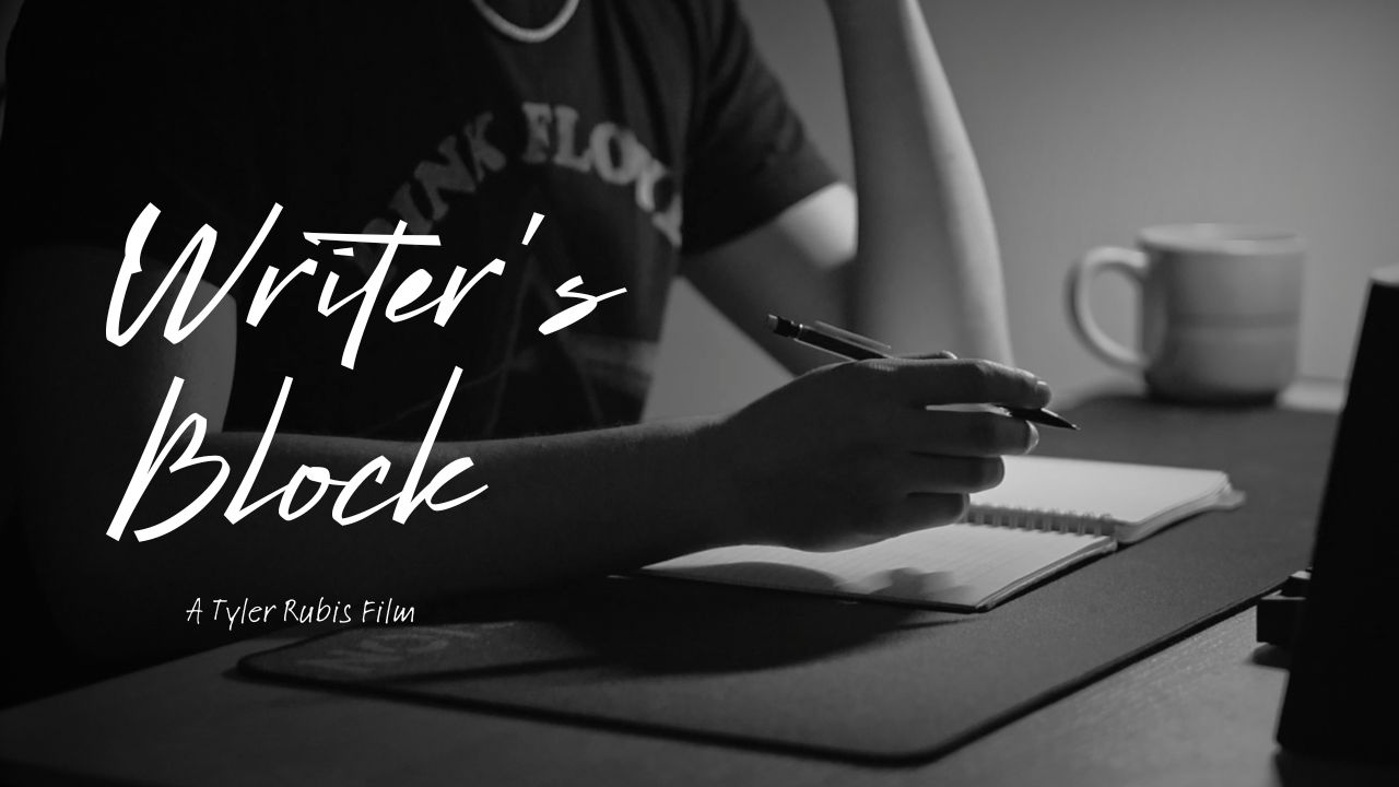
  • Mini Assignment #3: Writer’s Block

    Mini Assignment #3: Writer’s Block

    Create a story out of media only: a sequence of images, an audio production, a video production. No text.

  • Growing the Garden

    1–2 minutes

    I’ve been working on a number of improvements to my site, many of which I discussed in my previous process post “Site Layout Planning,” such as organizing my POSIEL content into tabs for Process Posts, Mini Assignments, and Peer Assessments. I also added more to my About Me page, with a new section for my achievements, listing films of mine that have been nominated or selected for film festivals.

    I also began adding content to my portfolio page, though I still have a lot of work to do there. I’m struggling a bit with how to lay out my work, as I have a blend of short films, photo series, and individual photos, which makes organization a bit difficult. I want to maintain a visually interesting layout, and I’m not currently satisfied with the system I’m using, which is divided into tabs, much like my POSIEL page. I also currently only have a handful of photo series, and none of my film work added. 

    My website has been changing slowly but steadily, and thinking back to my first version of the site, just over a month ago, feels very different than it does now. It’s a very different feeling to a social media profile, where your content can change but the layout and format remains essentially identical. Tanya Basu summarizes the idea nicely in her article in MIT Tech review: “In fact, the whole point of digital gardens is that they can grow and change, and that various pages on the same topic can coexist.”

  • Hunting for Texture

    Hunting for Texture

    There are lots of days where I don’t really want to pick my camera up. At times, I just don’t feel like I have the energy to go out somewhere and try to find a new, unique subject to shoot and plan composition and angles. Maybe the lighting feels off, I’m in a place I’ve already shot several times before, or maybe I’m just not in the mood. One thing I like to do when I’m feeling a bit of creative block in my photography is to take a step back and do something with low stakes.

    Some time ago, I remember seeing a trend going around online called ‘texture hunting,’ where people would go around with a lump of clay, a kneaded eraser, or other similar moldable material. They find a surface with a lot of texture, like tree bark or exposed brick, press the clay onto it to create an imprint, then, using ink, would stamp the textures into a notebook. Seeing that trend got me thinking about just how many different textures and patterns exist around us everywhere we go.

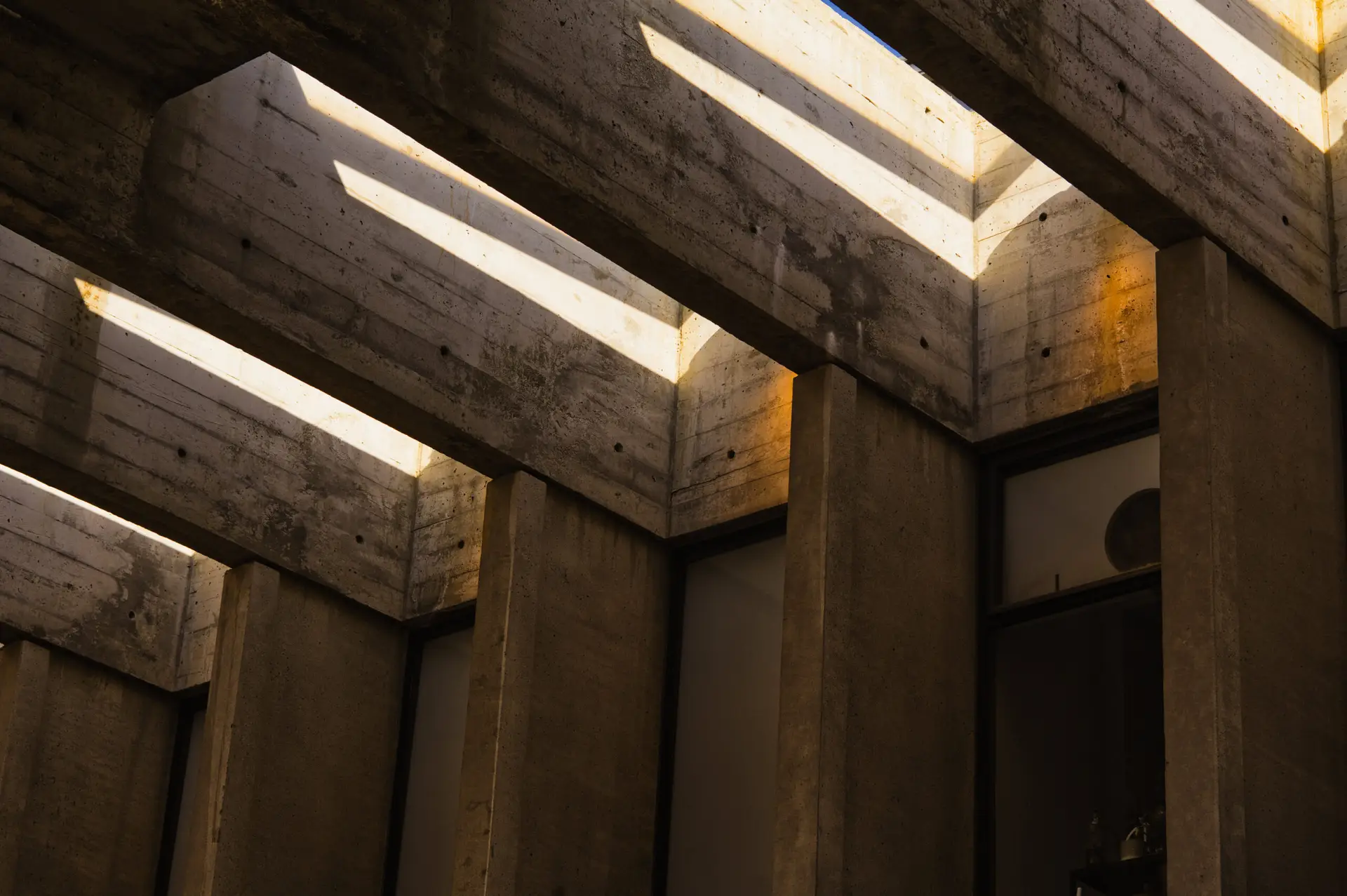
    Now texture photography is nothing new, but it’s something that I find to be really helpful in instances where the creative juices just aren’t flowing, and I feel like I have a slightly different approach than I’ve seen online. Often, texture photography, much like the online trend, focuses on small subjects and using macro lenses to bring out every tiny detail. I like to look a bit bigger. Instead of getting my camera close to a small object, I like to use a telephoto lens to bring a further object closer to me. With my camera, I can isolate one small section of a much larger subject, cropping out everything else, and creating ambiguous space. The tight framing can make it difficult to identify what exactly an object is, its size, and what angle it’s being shot from, forcing the viewer to instead focus solely on the lines and shapes that they can see.

    In my last post I talked a bit about the brutalist architecture of SFU’s Burnaby campus, which happens to be an excellent source of patterns. The straight, angular concrete creates plenty of bold shapes and, under the right lighting, incredible shadows. In some ways, it’s the perfect place to be when I’m feeling burnt out, because I can point my camera in practically any direction and find an interesting texture to shoot.

    Hunting for textures can be a lot of fun. It can take some of the stress and pressure out of photography, and is an easy way to get out and take photos even when I’m feeling unmotivated. The best part is that sometimes once I take that first step out the door with my camera, a wave of motivation hits me. Some of my favourite photos are from days where I wasn’t initially feeling up for it.

    At the end of the day, art should be fun. Your hobby should be something that you enjoy, and if some days you don’t feel up to a certain aspect of it, you can take a break from that part. A writer might set aside a big story to write something short, a painter might put down their oil paints to do a quick sketch, and I go out and shoot textures.