Author: Tyler Rubis

  • Imagined Audience

    As I’ve been developing my site, I’ve been working towards the goal of building a space for sharing more details about my work than I share elsewhere. The audience that I imagine for this site is one that is interested in the films and photography that I post on social media, and wants to know more about my creative process and thoughts through my blog posts. With my goal of using this website as a “professional” portfolio, I’ve been trying to keep the design simple and well-organized and maintain this look across all pages and posts. 

    Especially as I work towards importing my previous work, I want my photos to be the focal point of the site, not simply a decorative element. Ultimately, I feel like my site should be more about my work than it is about me, with my photos and films speaking for themselves. My blog posts are not meant to be technical or necessarily provide explanations for my work, but rather provide a bit of insight into the kinds of things that grab my interest and inspire my creative decisions.

    I don’t really expect to have a regular audience, a public that I speak to directly. I like to think that my site is more of an open journal, a place for my thoughts and ideas about my work that are perhaps too long or dense for social media, but available to read for anyone who is interested. In this way, I feel like I can keep my Instagram and Youtube a place to share my work quickly and in a way that is easily digestible, while still being able to put out more detailed writings as well.

  • Site Layout Planning

    Site Layout Planning

    1–2 minutes

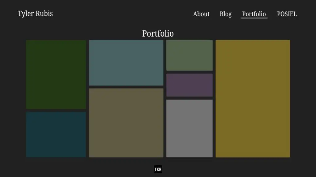
    I’ve spent the last several days planning how I want my site to look, and what improvements I’m planning to make. I’m really aiming for something minimal so that my photography can shine through as the central focus, and keeping a simple, professional tone so the site can serve as a portfolio.

    I’ve gone through created mock-ups of how I intend to change certain pages on my site, to compare them to how the pages currently look.

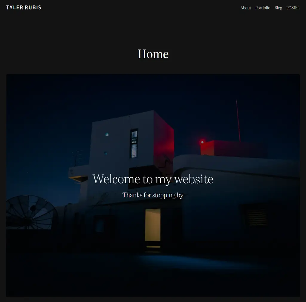
    Starting with the home page and general navigation, I’m planning to keep the overall appearance the same, with a single image and a short welcome message being the only piece of media on the page.

    As far as changes go, I want to replace the one still image with a gallery that will rotate through multiple photos one at a time. I also plan to make the navigation menu larger so that it is more visible and easier to access. I also want to minimize the gap between the picture/page title and the navigation bar, as I find the gap distracting.

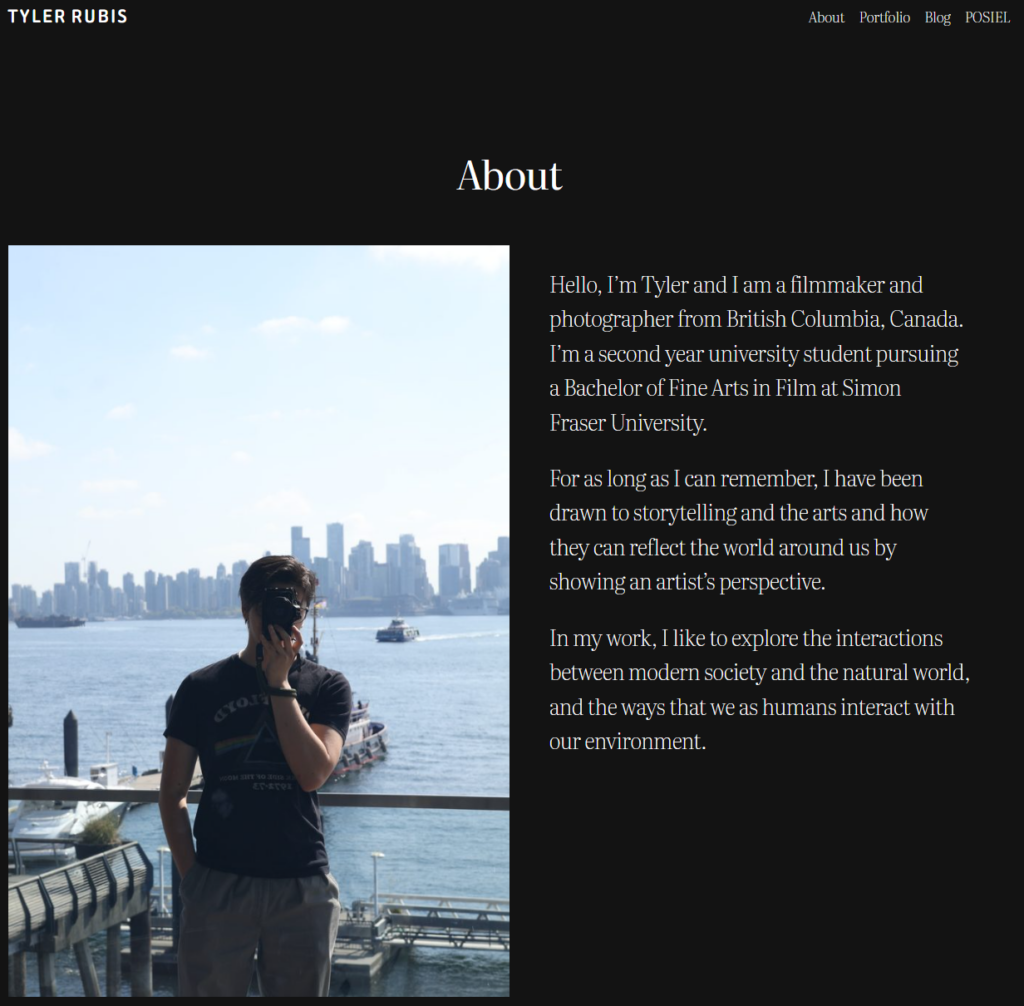
    For my About page, I mostly plan to add a bit more information about myself and my artistic vision and goals, as well as add a second section that highlights some of my achievements.

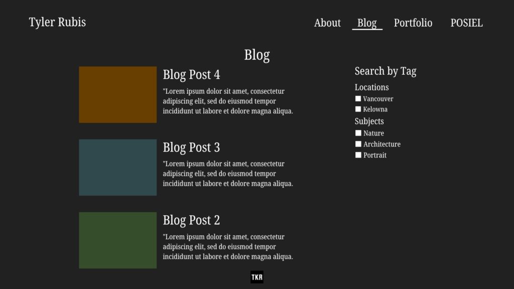
    For my Blog page, my main goal is to add search filters, so as I continue to write and develop my posts, users will be able to find specific topics without navigating through my entire blog history.

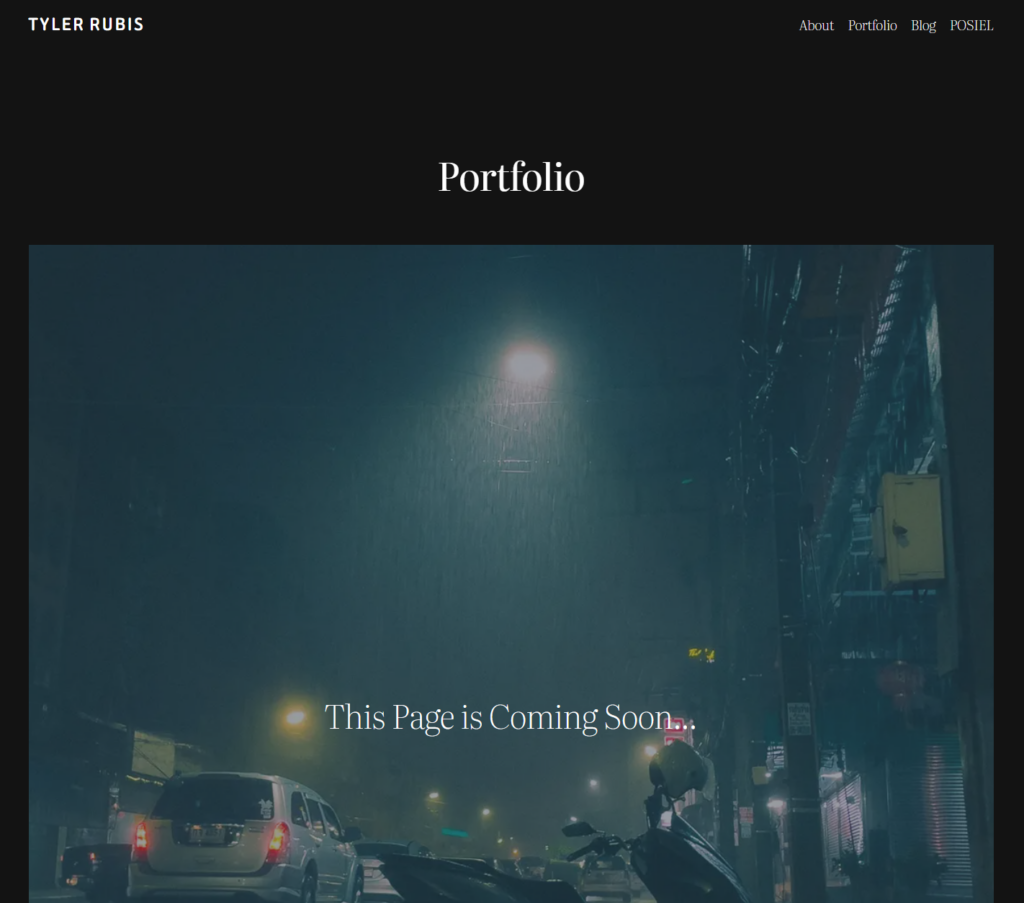
    This is where the most work needs to be done. I haven’t yet imported my existing photos and films into the site, but my goal is to work backwards, starting with the pictures that I’ve taken during this course that are complementary to my blog posts, and gradually adding my prior work,

    My objective is to create one big page full of photos, where the user can click on each one to enlarge it and reveal additional information, links to a related blog post, or other photos that are part of the series.

  • Finding Beauty in Brutalism

    Finding Beauty in Brutalism

    2–4 minutes

    There is a quote by the French painter Henri Matisse that I think about often:

    “There are always flowers for those who want to see them.”  

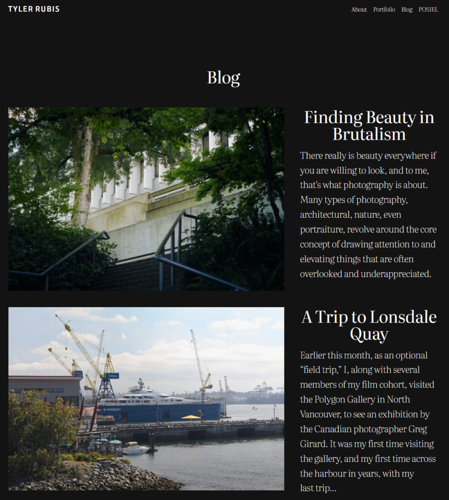
    There really is beauty everywhere if you are willing to look, and to me, that’s what photography is about. Many types of photography, architectural, nature, even portraiture, revolve around the core concept of drawing attention to and elevating things that are often overlooked and underappreciated. Photography is as much about creating art as it is about finding the art that already exists in the world. 

    When I go out, camera in hand, I don’t think to myself “Today, I am going to take a good picture,” I set out with the intention of exploring and finding something new, or perhaps seeing something familiar from a new perspective, or in a new light (sometimes literally, I love to see how the same area can look and feel entirely different depending on the weather/time of day). The way I see it, the world is only boring if you let it be, and few things demonstrate my belief as clearly as my school’s campus. 

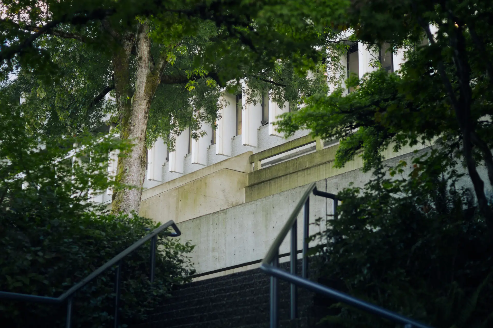
    Simon Fraser University is often called ugly and depressing, with some people going as far as to claim that it was designed as a prison (it wasn’t). Now I can appreciate that not everyone is a fan of the harsh lines and cold concrete of brutalist architecture, but the fact is that the designer, Arthur Erickson, is undeniably one of Canada’s most influential architects of all time. I could say a lot more about this, but that’s a topic/rant for another time.

    What I’m trying to say is that, from my point of view, SFU is beautiful. Is there a lot of plain grey concrete? Yes. Have multiple buildings on campus been used as set pieces for dystopian films? Yes. Have I personally shot a series of clips of the school on a foggy day and put Blade Runner music over it. YES. I won’t deny that at times, SFU’s Burnaby campus can feel quite utilitarian, but the issue is that some people can’t see past that.

    There have been days where I’ve walked across the campus to a lecture first thing in the morning and have noticed nothing but dull, lifeless concrete. However, I have also gone out and spent hours watching the koi fish in the pond, admired the vines on the side of the Bennett library that turn an incredible shade of red in autumn, and sat in the shade of the trees in front of the Dining Commons after bombing a unit test. I’ve brushed my fingers over the massive leaves of the monstera plants in the West Mall, walked through the mesozoic garden in the Shrum Science Center imagining plants that existed long before humans ever did, and slipped and fallen on the slopes of the grass pyramid in the middle of the AQ while taking a late night walk. 

    My point is that SFU isn’t just this slab of concrete slapped on top of a mountain, it’s an incredible blend of the natural world and human construction. You’ll walk across concrete for ten minutes, but turn your head in any direction, and odds are you’ll see a tree, a bush, or full planter box. If you walk around expecting to see a prison, then that’s the experience that you’ll have, but the truth is that the school is vibrant and full of life.

    All you need is the right perspective.

    -Tyler

  • Peer Assessment #1

    Peer Assessment #1

    2–3 minutes

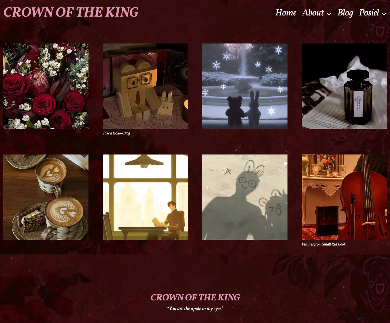
    This week I am reviewing Sitong Li’s site luodenghua.com, CROWN OF THE KING. Immediately upon opening the site, I was greeted by an elegant, dark red patterned background and a selection of images that visually complemented the site’s warm colour palette.

    Navigating to the site’s About tab revealed a drop down menu with the options: About Me, About Game, and About Evan Lu. As I went through the 3 sections, I learned a bit about Sitong as a second year communications student at SFU and the focus of her website: a romance video game called Light and Night.

    The website focuses on Sitong’s favourite character from the game, Evan Lu, and through the character’s ‘about’ page and blog posts, provides the audience with background information and game/character lore in a simple and easily-understandable way. Sitong also explains that she intends to generally discuss the genre of romance or otome games where the player plays as a female protagonist and features male love interests, whether or not the viewer is themselves familiar with or plays said games.

    As a whole, the site is very aesthetically pleasing and presents a clear online persona of the author and her interests. As Danah Boyd wrote, even prior to the internet and social media teens have “tried to create publics from their own homes,” and they “often use media and new technologies to do so” (2014). This is something that can be seen in this website, as it is aimed at a very particular audience, sharing content for this specific public.

    I particularly like the thoughtfulness of the site’s design in terms of navigation, as nearly every page has neatly organized buttons that redirect the user to other related pages, or dropdown menus and text boxes that provide further context and information. This design allows the individual pages to maintain a simple appearance when first opened, but lets the user conveniently navigate deeper into the site.

    The site also makes effective use of images, either providing a visual reference for users who may not be familiar with Light and Night and the character of Evan Lu, or by adding personality and individuality, as seen in the ‘About Me’ page.

    If I were to make any suggestions, I would note that on a few pages, such as the ‘About game’ page, contain some quite small text, or text colours that slightly blend into the background such as on the Blog page. The layout of the Process Posts page also feels slightly cumbersome as navigating between posts requires returning to the initial page. Adding a way to navigate from post to post, within the individual posts themselves would make reading through them more fluid and seamless.

    Ultimately, Sitong’s site feels like an ernest and genuine presentation of one of her interests, while also having a unique and clearly defined visual aesthetic that seems to compliment the tone of the game and character in a meaningful and intentional way. While I may not be at all familiar with the website’s primary subject, I appreciate the site’s design and the intentionality behind it, and I am interested to see how it develops further over the duration of the course.

    References

    Boyd, Danah. 2014 “Searching for a public of their own.” It’s Complicated. pp 213-227

  • Mini Assignment #2: A Guest Post by Spider-Man

    Mini Assignment #2: A Guest Post by Spider-Man

    3–5 minutes

    Alright, alright, I know what you’re thinking: 

    “What on earth is Spider-Man doing in Vancouver, British Columbia?” 

    And you know what, that’s a pretty reasonable question to be asking. Surely I should be swinging around the streets of Manhattan catching bad guys, stopping runaway trains, and helping cats out of trees right? Well, it’s a little bit of a weird story…

    A few days ago, I caught some tough dudes in ski masks hijacking an armoured truck right in the middle of Fifth Avenue. Nothing too crazy; it happens every other week. A few well placed webs and the thugs are dangling from the lampposts with the truck parked right below them. I figured I might as well take a peak and see what these guys were trying to snatch, so I popped open the back of the truck and it was NOT what I expected. Half of the interior was taken up by a glass box with a whole miniature ecosystem built inside it, and in the middle, laying on the artificial grass was a raccoon. I snooped around the rest of the truck, trying to find any hints as to what a couple of street thugs were doing trying to steal a terrarium on wheels, but it turned up empty. The only hint was a label on the enclosure that read “Burnaby Mountain Park.”

    I did some digging but I couldn’t find any information on the raccoon or the truck, and when the NYPD interrogated the hijackers, they said they got the job from some anonymous businessman and didn’t know anything else. Heck, I even took the little guy, who I decided to start calling Reggie, over to the Baxter building and let my friend Reed run some tests but he couldn’t find anything unusual either. 

    By this point I had gotten pretty fond of Reggie, but I could tell that he didn’t feel at home in my apartment, so I figured the best thing I could do was to get him home. Now, I didn’t know this but APPARENTLY no mail couriers want to transport a live raccoon, and all of my so called friends with their secret superhero jets were “too busy” to help me get Reggie home so my only option was to throw him in a baby carrier and and take him home myself. FYI, New York to Vancouver? NOT a short trip. Reggie and I hitched a few rides on trucks, trains, and even a nice guy with a Winnebago in Montana.

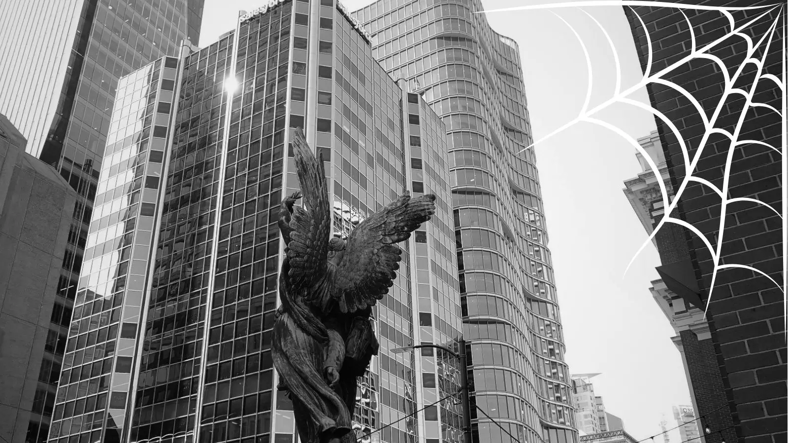
    The point is, it took us three and a half days but eventually we made it, and I gotta say, it’s pretty nice here! We got into the city around seven in the morning so I decided to explore with Reggie and take a few selfies for my ahem friend Peter Parker over at the Daily Bugle. We got some good web swinging in, but I will say that metro Vancouver is definitely no Manhattan, and I ran out of tall enough buildings to swing from pretty quickly. Reggie and I got a few odd looks on the SkyTrain but after a LONG journey, we made it to Burnaby Mountain.

    As soon as we got on to a trail, Reggie started getting all excited so I let him out of the baby carrier and he instantly started scampering around. Aw man, I wish I had taken a video, he looked so happy! I walked around with him a little more before I got a message that a certain school’s secret jet happened to be passing by and that they’d be willing to give me a ride home, so Reggie and I said our goodbyes (or at least I did, he kinda started rummaging in a garbage bin) and I got ready to leave.

    So yeah, long story short, I travelled 2,500 miles just to drop off a raccoon. Was it worth it? Three long nights riding on the tops of cargo trains and semi trucks? Absolutely. I got to see Vancouver, hang out with my friend Reggie, and Scott even let me fly the Blackbird on the way home (well, for 30 seconds before I told him that I didn’t even have my driver’s license)! So at the end of the day, I’d say it was a solid 7.5 out of 10 trip.

    And don’t worry Reggie, I’ll come back to visit!

    -Your friendly neighborhood Spider-Man